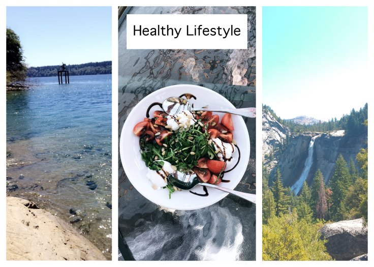
This a podcast I created using the Adobe software, Audition. The podcast is a short interview where I interview my friend and roommate, Mya about the different aspects of living a healthy lifestyle in collage. The podcast is compiled of two clips. One is the introduction to the podcast and the second clip the conversation between myself and Mya.
I began this process by first creating a draft. When starting the draft I started by recording the audio content. into a quiet room in my house to eliminate as much background noise as possible. I used the Voice Memos app on my smart phone to capture the audio. I first recorded myself introducing the podcast. Right after this I recorded the conversation between myself and Mya. I did give her a preview of the questions before we started recording but we did not practice or make a script because I really wanted to have an authentic conversation for the podcast.
Using Audition, I opened a multitrack session. I uploaded the first audio clip of the introduction. I took the razor tool and deleted some unnecessary audio and trimmed the beginning and end which were just awkward silences. I then moved the track to the beginning of the session, so it would begin as soon as I pressed play.
I then uploaded the second audio clip of the actual interview. I placed that clip in a second track, so the clips would be easier to manage. I trimmed a bit of end which was just an awkward pause. I then took that clip and moved it, so it would begin as soon as the first clip was over.
After receiving feedback on my draft, I decided to use a sound effect in the beginning and the end of the podcast. I looked online for some free sound effects online but the one I ended up liking the best was actually the chimes effect that was used in my previous blog post, Audition Tutorials.
I uploaded the chime file and to the multitrack session on a new track. After listening to the file, I selected the section I liked best. I used the razor tool to cut down the file to the part I liked. I put the audio clip at the beginning of the session and shifted the other clips down, so the session would begin with the chimes. I selected the audio clip of the chimes and copied and pasted it in the same track and placed it at the end of the session. This way the session would end with the chimes as well.
For the finishing touch, I adjusted the volume on both of the chime clips. For the clip in the beginning I adjusted the volume, so the chimes would fade into the speaking parts of the podcast. For the clip in at the end I adjusted the volume, so the chimes got louder at the end and did not start off super loud.
I am very proud of this podcast and think it shows the skills I have obtained using Audition.