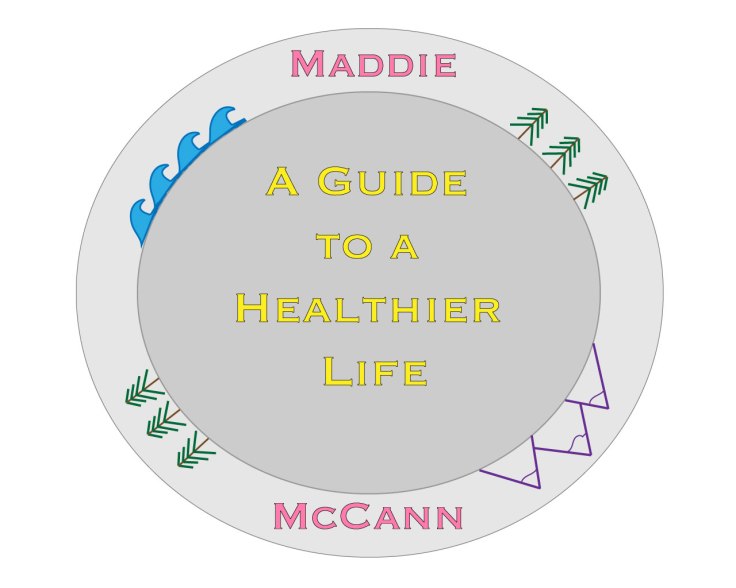
For this assignment I made a logo for my blog. the purpose of my blog is to help people in college achieve a healthier life style. Using Adobe Illustrator, I created a plate to symbolize healthy eating with pictures of elements of nature. Using the shape tool, I created a large circle. I copied pasted the circle and made it slightly smaller. After selecting the smaller circle, I filled it with a dark grey and added a stroke. I then selected the larger circle and filled it with a light grey. I then used the text tool to write the phrase, “A Guide to a Healthier Lifestyle”. I colored the text yellow to match my blog’s overall theme. I also added a stroke to the text. I used the text tool again to write my name and added a stroke. I separate my name and placed them on the outer layer of the plate.
The next step was creating the pictures. I used the line tool I created a tree. Then, I selected the multiple lines that made up the tree and grouped them together to create a singular object. Using the select tool I copied and pasted the tree a few times and placed it on the plate. I also rotated the trees, so they followed the outline of the plate.
The next picture I made was the waves. To this I took the pencil tool and drew an outline of the wave and used the smoothing tool to make the lines less rough and jagged. I colored the them and added a stroke to create an outline, which made the wave pop. I then copied and pasted the wave a few times and aligned them up to create water. I then grouped the waves together and rotated them and placed them on the plate.
The final picture I drew was the mountain. For the first mountain I used the line tool to draw the outline and then the pencil tool to create the snow effect. I then copied and pasted that mountain. I then repeated that process to create a slightly taller mountain to place in the middle of the two other mountains. I then grouped the three mountains together and placed them on the plate.
For my final image I think I want to add a few more effects to make the image look a bit more realistic and possibly add an apple like I had in my initial sketch. Overall, I am pleased with how the draft turned out and think it showcases the skills I have learned with Adobe Illustrator.

Leave a comment